Navbar with Notification:
Hello Everyone, Today I will show you a simple but Amazing Navbar using HTML, CSS, Bootstrap, and some JS. Let’s start
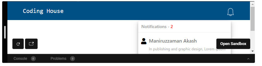
Let’s See the Design:
The below design is the final output that you will get as the final result of this content.
HTML Part:
To make this I use a normal HTML table.
Here is the HTML code:
<nav>
      <div class="logo">Coding House</div>
      <div class="icon" id="bell">
        <img src="https://i.imgur.com/AC7dgLA.png" alt="" />
      </div>

      <div class="notifications" id="box">
        <h2>Notifications - <span>2</span></h2>
        <div class="notifications-item">
          <i class="fas fa-user"></i>
          <div class="text">
            <h4>Maniruzzaman Akash</h4>
            <p>In publishing and graphic design, Lorem ipsum is a</p>
          </div>
        </div>
        <div class="notifications-item">
          <i class="fas fa-user"></i>
          <div class="text">
            <h4>Fabliha Afia</h4>
            <p>In publishing and graphic design, Lorem ipsum is a</p>
          </div>
        </div>
      </div>
    </nav>
Now, Start with our simple CSS code
CSS Part:
@import url("https://fonts.googleapis.com/css2?family=Manrope:wght@200&display=swap");

* {
  padding: 0px;
  margin: 0px;
}

nav {
  display: flex;
  align-items: center;
  background: #005086;
  height: 60px;
  position: relative;
}

i.fas.fa-user {
  color: black;
  font-size: 20px;
  margin-top: 5px;
  margin-right: 8px;
}
.icon {
  cursor: pointer;
  margin-right: 50px;
  line-height: 60px;
  position: absolute;
  right: 0px;
  bottom: 0px;
}

.icon span {
  background: #f00;
  padding: 7px;
  border-radius: 50%;
  color: #fff;
  vertical-align: top;
  margin-left: -25px;
}

.icon img {
  display: inline-block;
  width: 26px;
  margin-top: 4px;
}

.icon:hover {
  opacity: 0.7;
}

.logo {
  flex: 1;
  margin-left: 50px;
  color: #eee;
  font-size: 20px;
  font-family: monospace;
  padding-top: 2px;
}

.notifications {
  width: 300px;
  height: 0px;
  opacity: 0;
  position: absolute;
  top: 63px;
  right: 62px;
  border-radius: 5px 0px 5px 5px;
  background-color: #fff;
  box-shadow: 0 4px 8px 0 rgba(0, 0, 0, 0.2), 0 6px 20px 0 rgba(0, 0, 0, 0.19);
}

.notifications h2 {
  font-size: 14px;
  padding: 10px;
  border-bottom: 1px solid #eee;
  color: #999;
}

.notifications h2 span {
  color: #f00;
}

.notifications-item {
  display: flex;
  border-bottom: 1px solid #eee;
  padding: 6px 9px;
  margin-bottom: 0px;
  cursor: pointer;
}

.notifications-item:hover {
  background-color: #eee;
}

.notifications-item img {
  display: block;
  width: 50px;
  height: 50px;
  margin-right: 9px;
  border-radius: 50%;
  margin-top: 2px;
}

.notifications-item .text h4 {
  color: #777;
  font-size: 16px;
  margin-top: 3px;
}

.notifications-item .text p {
  color: #aaa;
  font-size: 12px;
}
@media only screen and (max-width: 320px) {
  .notifications {
    right: 10px;
  }
}
@media only screen and (max-width: 320px) {
  .notifications {
    width: 245px;

    right: 17px;
  }
}
JS Code:
$(document).ready(function () {
  var down = false;

  $("#bell").click(function (e) {
    var color = $(this).text();
    if (down) {
      $("#box").css("height", "0px");
      $("#box").css("opacity", "0");
      down = false;
    } else {
      $("#box").css("height", "auto");
      $("#box").css("opacity", "1");
      down = true;
    }
  });
});
Collapse Navbar:
In this navbar i use HTML,CSS,Bootstrap and some Javascript.
Let’s start
Let’s See the Design:
10 Amazing Responsive Navbar using HTML, CSS:
Let’s start
Let’s See the Design: