Hello Everyone, Today I will show you how to make a simple but attractive animated button using some Bootstrap CSS.
Live Demo Link: https://5ddtb.csb.app
Codesandbox Link: https://codesandbox.io/s/simple-button-5ddtb-5ddtb?file=/css/style.css
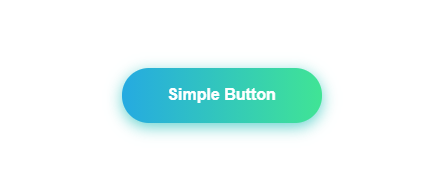
Let’s See the Design:
HTML Part:
Here is HTML button code. To make this simple button use the two classes btn and btn-gradient.
<button class="btn btn-gradient">
Simple Button
</button>
Now, Start with our simple CSS code
CSS Part:
Let’s design the basic button:
Create a class called .btn and put the CSS there.
.btn {
  width: 200px;
  font-size: 16px;
  font-weight: 600;
  color: #fff;
  cursor: pointer;
  margin: 20px;
  height: 55px;
  text-align: center;
  border: none;
  background-size: 300% 100%;
  border-radius: 50px;
  moz-transition: all 0.4s ease-in-out;
  -o-transition: all 0.4s ease-in-out;
  -webkit-transition: all 0.4s ease-in-out;
  transition: all 0.4s ease-in-out;
}
Gradient Color:
After creating the basic structure let’s add some gradient color to make it more attractive.
.btn-gradient {
  background-image: linear-gradient(
    to right,
    #25aae1,
    #40e495,
    #30dd8a,
    #2bb673
  );
  box-shadow: 0 4px 15px 0 rgba(49, 196, 190, 0.75);
}
Hover Effect:
If you want some animation with a hover effect then you can add more CSS like :
.btn:hover {
  background-position: 100% 0;
  moz-transition: all 0.4s ease-in-out;
  -o-transition: all 0.4s ease-in-out;
  -webkit-transition: all 0.4s ease-in-out;
  transition: all 0.4s ease-in-out;
}

.btn:focus {
  outline: none;
}