Hello Everyone, Today I will implement a frosted glass effect clock using simple HTML, CSS and write some JS code for the real flavor of this beautiful clock.
Let’s start :
Live Demo Link:https://9034s.csb.app/
Codesandbox Link: https://codesandbox.io/s/frosting-glass-clock-9034s-9034s?from-embed
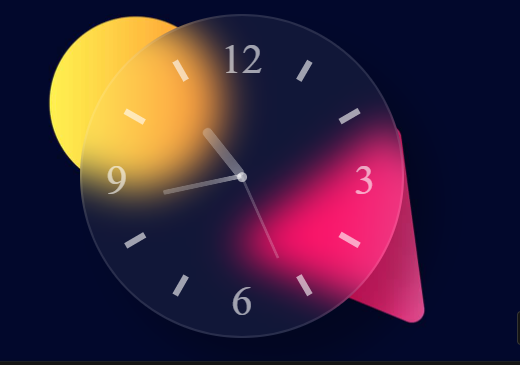
Let’s See the Design:
The below design is the final output that you will get as the final result of this content.
HTML Part:
To make this blurry effect clock you just need a parent class name clock and some subclass like an hour, minute, seconds. Here, I use a common class name hand to minimize some CSS. I put some common CSS properties in this class and then call in all subclasses.
Here is the HTML code:
<div class="clock">
      <img
        src="https://dl.dropbox.com/s/f3b3lyanili7zl2/clock%20template-01.svg?raw=1"
      />
      <div class="hour hand" id="hour"></div>
      <div class="minute hand" id="minute"></div>
      <div class="seconds hand" id="seconds"></div>
    </div>
Now, Start with our simple CSS code
CSS Part:
Let’s design the Body:
body {
  background: url(https://dl.dropbox.com/s/8bojjv34k37t16m/Webp.net-resizeimage%20%282%29.jpg?raw=1)
    no-repeat center center fixed;

  background-size: cover;
  width: 100%;
  height: 100vh;
  padding: 0;
  margin: 0;
}
In the body part, I use a background image for the background and fix the image.
.clock {
  height: 310px;
  width: 310px;
  background-color: rgba(255, 255, 255, 0.06);
  -webkit-backdrop-filter: blur(20px);
  backdrop-filter: blur(20px);
  border-radius: 50%;
  position: absolute;
  margin: auto;
  top: 0;
  bottom: 0;
  left: 0;
  right: 0;
  -webkit-box-shadow: 30px 30px 35px rgba(0, 0, 0, 0.25);
  box-shadow: 30px 30px 35px rgba(0, 0, 0, 0.25);
  border: 2px solid rgba(255, 255, 255, 0.1);
}
In the clock class basically, I take the same value for height, width so that the clock can be a perfectly round shape. backdrop-filter property is used to give the blur effect the clock.-webkit property is used for browser support.
img {
  opacity: 0.6;
}

.hand {
  position: absolute;
  margin: auto;
  left: 0;
  right: 0;
  background-color: rgba(255, 255, 255, 0.2);
  -webkit-backdrop-filter: blur(20px);
  backdrop-filter: blur(20px);
  border-radius: 5px;
  -webkit-transform-origin: bottom;
  -ms-transform-origin: bottom;
  transform-origin: bottom;
}
.hour {
  height: 60px;
  width: 10px;
  top: 100px;
}
.minute {
  height: 80px;
  width: 5px;
  top: 80px;
}
Minute class is used for minute.
.seconds {
  height: 90px;
  width: 3px;
  top: 70px;
}
Seconds class is used for seconds.
JS Code:
For a real-time flavor of the clock, I use some js code. If you don’t want the real-time clock then you can skip this part.
var hour = document.getElementById("hour");
var minute = document.getElementById("minute");
var seconds = document.getElementById("seconds");
You can see that here I take three variables for an hour, minute, and seconds.
var set_clock = setInterval(function clock() {
  var date_now = new Date();
  var hr = date_now.getHours();
  var min = date_now.getMinutes();
  var sec = date_now.getSeconds();

  var calc_hr = hr * 30 + min / 2;
  var calc_min = min * 6;
  var calc_sec = sec * 6;

  hour.style.transform = "rotate(" + calc_hr + "deg)";
  minute.style.transform = "rotate(" + calc_min + "deg)";
  seconds.style.transform = "rotate(" + calc_sec + "deg)";
}, 1000);
and take one more variable set_clock to store the function.
Full Source Code:
<body>
    <div class="clock">
      <img
        src="https://dl.dropbox.com/s/f3b3lyanili7zl2/clock%20template-01.svg?raw=1"
      />
      <div class="hour hand" id="hour"></div>
      <div class="minute hand" id="minute"></div>
      <div class="seconds hand" id="seconds"></div>
    </div>

    <script src="js/main.js"></script>
  </body>
body {
background: url(https://dl.dropbox.com/s/8bojjv34k37t16m/Webp.net-resizeimage%20%282%29.jpg?raw=1)
no-repeat center center fixed;
background-size: cover;
width: 100%;
height: 100vh;
padding: 0;
margin: 0;
}
.clock {
height: 310px;
width: 310px;
background-color: rgba(255, 255, 255, 0.06);
-webkit-backdrop-filter: blur(20px);
backdrop-filter: blur(20px);
border-radius: 50%;
position: absolute;
margin: auto;
top: 0;
bottom: 0;
left: 0;
right: 0;
-webkit-box-shadow: 30px 30px 35px rgba(0, 0, 0, 0.25);
box-shadow: 30px 30px 35px rgba(0, 0, 0, 0.25);
border: 2px solid rgba(255, 255, 255, 0.1);
}
img {
opacity: 0.6;
}
.hand {
position: absolute;
margin: auto;
left: 0;
right: 0;
background-color: rgba(255, 255, 255, 0.2);
-webkit-backdrop-filter: blur(20px);
backdrop-filter: blur(20px);
border-radius: 5px;
-webkit-transform-origin: bottom;
-ms-transform-origin: bottom;
transform-origin: bottom;
}
.hour {
height: 60px;
width: 10px;
top: 100px;
}
.minute {
height: 80px;
width: 5px;
top: 80px;
}
.seconds {
height: 90px;
width: 3px;
top: 70px;
}var hour = document.getElementById("hour");
var minute = document.getElementById("minute");
var seconds = document.getElementById("seconds");
var set_clock = setInterval(function clock() {
var date_now = new Date();
var hr = date_now.getHours();
var min = date_now.getMinutes();
var sec = date_now.getSeconds();
var calc_hr = hr * 30 + min / 2;
var calc_min = min * 6;
var calc_sec = sec * 6;
hour.style.transform = "rotate(" + calc_hr + "deg)";
minute.style.transform = "rotate(" + calc_min + "deg)";
seconds.style.transform = "rotate(" + calc_sec + "deg)";
}, 1000);