Hello, Everyone Today I will show you how to create a form input field. Let’s see the demo :
Live Demo Link: https://6ojt2.csb.app/
Codesandbox Link:https://codesandbox.io/s/form-input-6ojt2-6ojt2?file=/index.html
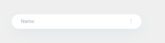
Let’s See the Design:
To create this beautiful input field you just need Basic HTML and CSS. Let’s start
HTML Part:
To make this beautiful input field you just need a parent class name input-group and a form input and a level. On the right side icon just need a class name req-mark.
<div class="input-group">
      <input
        value=""
        class="form-control"
        type="text"
        name="text-1542372332072"
        id="text-1542372332072"
        required="required"
        placeholder="Ihr Name"
      />
      <label for="text-1542372332072"> Name</label>
      <div class="req-mark">!</div>
    </div>
CSS Part:
Let’s design the form input:
Create a class called input-group and put the CSS here,
.input-group {
  display: block;
  width: 441px;
  max-width: 100%;
  height:50px;
  border: 0;
  background-color: #ffffff;
  border-bottom-left-radius: 41px;
  border-bottom-right-radius: 41px;
  border-top-left-radius: 41px;
  border-top-right-radius: 41px;
  box-shadow: 0 17px 40px 0 rgba(75, 128, 182, 0.07);
  margin-bottom: 22px;
  position: relative;
  font-size: 17px;
  color: #a7b4c1;
  transition: opacity 0.2s ease-in-out, filter 0.2s ease-in-out,
    box-shadow 0.1s ease-in-out;
}
After designing the parent div add some CSS for input design
.input-group input {
  position: absolute;
  border: 0;
  box-shadow: none;
  background-color: rgba(255, 255, 255, 0);
  top: 0;
  height: 36px;
  width: 100%;
  padding: 0 31px;
  box-sizing: border-box;
  z-index: 3;
  display: block;
  color: #00000055;

  font-size: 17px;
  font-family: "Oxygen", sans-serif;
  transition: top 0.1s ease-in-out;
}
.input-group input::placeholder {
color: rgba(0, 0, 0, 0);
}
.input-group input:focus,
.input-group input:not(:placeholder-shown) {
top: 17px;
}
.input-group label {
position: absolute;
border: 0;
top: 0;
left: 0;
right: 0;
bottom: 0;
z-index: 2;
display: flex;
align-items: center;
padding: 0 31px;
box-sizing: border-box;
transition: all 0.1s ease-in-out;
cursor: text;
}
.input-group input:focus + label,
.input-group input:not(:placeholder-shown) + label {
bottom: 20px;
font-size: 13px;
opacity: 0.7;
}Input icon CSS:
.req-mark {
position: absolute;
pointer-events: none;
top: 0;
right: 33px;
bottom: 0;
display: flex;
align-items: center;
justify-content: flex-end;
font-size: 22px;
color: #e0e0e0;
font-family: "Ubuntu", sans-serif;
}Hover Effect:
.input-group:hover {
box-shadow: 0 14px 44px 0 rgba(0, 0, 0, 0.077);
}
Full Source Code of CSS Example:
*:focus {
outline: none;
}
body {
background-color: #efefef;
padding: 70px;
font-family: "Open Sans", "Arial", snas-serif;
}
.input-group {
display: block;
width: 441px;
max-width: 100%;
height:50px;
border: 0;
background-color: #ffffff;
border-bottom-left-radius: 41px;
border-bottom-right-radius: 41px;
border-top-left-radius: 41px;
border-top-right-radius: 41px;
box-shadow: 0 17px 40px 0 rgba(75, 128, 182, 0.07);
margin-bottom: 22px;
position: relative;
font-size: 17px;
color: #a7b4c1;
transition: opacity 0.2s ease-in-out, filter 0.2s ease-in-out,
box-shadow 0.1s ease-in-out;
}
.input-group input {
position: absolute;
border: 0;
box-shadow: none;
background-color: rgba(255, 255, 255, 0);
top: 0;
height: 36px;
width: 100%;
padding: 0 31px;
box-sizing: border-box;
z-index: 3;
display: block;
color: #00000055;
font-size: 17px;
font-family: "Oxygen", sans-serif;
transition: top 0.1s ease-in-out;
}
.input-group input::placeholder {
  color: rgba(0, 0, 0, 0);
}

.input-group input:focus,
.input-group input:not(:placeholder-shown) {
  top: 17px;
}

.input-group label {
  position: absolute;
  border: 0;
  top: 0;
  left: 0;
  right: 0;
  bottom: 0;
  z-index: 2;
  display: flex;
  align-items: center;
  padding: 0 31px;
  box-sizing: border-box;
  transition: all 0.1s ease-in-out;
  cursor: text;
}

.input-group input:focus + label,
.input-group input:not(:placeholder-shown) + label {
  bottom: 20px;
  font-size: 13px;
  opacity: 0.7;
}
.req-mark {
  position: absolute;
  pointer-events: none;
  top: 0;
  right: 33px;
  bottom: 0;
  display: flex;
  align-items: center;
  justify-content: flex-end;
  font-size: 22px;
  color: #e0e0e0;
  font-family: "Ubuntu", sans-serif;
}
.input-group:hover {

box-shadow: 0 14px 44px 0 rgba(0, 0, 0, 0.077);

}