Today I will show you how to create an amazing animated card. Let’s see the demo :
Live Demo Link: https://kp38h.csb.app/
Codesandbox Link: https://codesandbox.io/s/product-card-kp38h-kp38h?file=/css/style.css
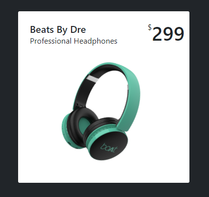
Let’s See the Design:
To create this amazing card you don’t need to know so many things. Just need Bootstrap CSS and Basic HTML.
HTML Part:
Here is the HTML card code. To make this amazing card you have to wrap the main div class name card then add some subclasses like product-info to give some information about the product. Then use product-price class to define the price of the product. Then add heart class to wrap the heart icon.
After completing the upper portion of the product card design add the product-image class to wrap the product image.
At the end of the card, I use two-button one for view and one for Buy.
<div class="card p-2">
            <div class="product-info px-3 py-3">
                <div>
                    <h5 class="mb-0">Beats By Dre</h5> <span>Professional Headphones</span>
                </div>
                <div class="product-price d-flex flex-row"> <span>$</span>
                    <h1>299</h1>
                </div>
                <div class="heart"> <i class="far fa-heart"></i></i> </div>
            </div>
            <div class="text-center product-image"> <img src="https://i.imgur.com/hpftqCo.png"> </div>
            <div class="product-about">
                <p>It is a long established fact that a reader will be distracted by the readable content of a page when looking at its layout. The point of using Lorem Ipsum is that it has a more-or-less normal distribution of letters, as opposed</p>
            </div>
            <div class="button d-flex flex-row gap-3 px-3"> <button class="btn btn-danger w-100">View</button> <button class="btn btn-outline-danger w-100">Buy Now</button> </div>
        </div>
Now, Start with our simple CSS code
CSS Part:
Let’s design the Basic card:
Create a class called card and put the CSS here,
.card {
  width: 350px;
  border: none;
  height: 350px;
  border-radius: 3px;
  cursor: pointer;
  position: relative;
  overflow: hidden;
  background-color: white;
  padding-left: 15px;
  margin-top: 20px;
}.product-info {
display: flex;
justify-content: space-between;
}
.product-price {
position: absolute;
right: 10px;
top: 20px;
}
.product-image img {
width: 240px;
transform: rotate(15deg);
transition: all 0.5s;
}
.product-about {
position: absolute;
width: 170px;
font-size: 10px;
top: 140px;
left: -125px;
opacity: 0;
}.button {
position: absolute;
bottom: -150px;
}
.btn {
height: 50px;
font-size: 16px;
width: 140px !important;
font-weight: 600;
}
.heart i {
font-size: 50px;
opacity: 0;
color: red;
}Hover Effect:
Now add some code to create a hover effect :
.heart i:hover {
color: red;
}
.card:hover .heart i {
animation: heart 300ms ease-in forwards;
animation-delay: 500ms;
}.card:hover .product-about {
animation: content 300ms ease-in forwards;
}
.card:hover .product-image img {
animation: onimage 300ms ease-in forwards;
}
.card:hover .product-price {
animation: onprice 500ms ease-in forwards;
}
.card:hover .button {
animation: button 500ms ease-in forwards;
}Animation Part:
Use @Keyframes for animation
@keyframes content {
0% {
opacity: 0;
}
100% {
opacity: 1;
left: 25px;
}
}
@keyframes heart {
0% {
opacity: 0;
}
100% {
opacity: 1;
}
}
@keyframes onprice {
0% {
right: 10px;
top: 20px;
}
50% {
right: 60px;
top: 30px;
}
100% {
right: 267px;
top: 70px;
}
}
@keyframes onimage {
0% {
width: 250px;
}
50% {
width: 200px;
transform: translateY(-30px);
transform: translateX(100px);
}
100% {
width: 180px;
top: 100px;
transform: translateY(100px);
transform: translateX(110px);
}
}
@keyframes button {
0% {
bottom: -100px;
}
100% {
bottom: 20px;
}
}Full Source Code of CSS Example:
body {
background: gray;
}
.card {
width: 350px;
border: none;
height: 350px;
border-radius: 3px;
cursor: pointer;
position: relative;
overflow: hidden;
background-color: white;
padding-left: 15px;
margin-top: 20px;
}
.product-info {
  display: flex;
  justify-content: space-between;
}

.product-price {
  position: absolute;
  right: 10px;
  top: 20px;
}

.product-image img {
  width: 240px;
  transform: rotate(15deg);
  transition: all 0.5s;
}
.product-about {
  position: absolute;
  width: 170px;
  font-size: 10px;
  top: 140px;
  left: -125px;
  opacity: 0;
}
.button {
position: absolute;
bottom: -150px;
}

.btn {
height: 50px;
font-size: 16px;
width: 140px !important;
font-weight: 600;
}
.heart i {
font-size: 50px;
opacity: 0;
color: red;
}
/* hover effect */
.heart i:hover {
  color: red;
}
.card:hover .heart i {
  animation: heart 300ms ease-in forwards;
  animation-delay: 500ms;
}
.card:hover .product-about {
  animation: content 300ms ease-in forwards;
}

.card:hover .product-image img {
  animation: onimage 300ms ease-in forwards;
}

.card:hover .product-price {
  animation: onprice 500ms ease-in forwards;
}

.card:hover .button {
  animation: button 500ms ease-in forwards;
}
/* Animation */
@keyframes content {
  0% {
    opacity: 0;
  }

  100% {
    opacity: 1;
    left: 25px;
  }
}

@keyframes heart {
  0% {
    opacity: 0;
  }

  100% {
    opacity: 1;
  }
}
@keyframes onprice {
  0% {
    right: 10px;
    top: 20px;
  }

  50% {
    right: 60px;
    top: 30px;
  }

  100% {
    right: 267px;
    top: 70px;
  }
}

@keyframes onimage {
  0% {
    width: 250px;
  }

  50% {
    width: 200px;
    transform: translateY(-30px);
    transform: translateX(100px);
  }

  100% {
    width: 180px;
    top: 100px;
    transform: translateY(100px);
    transform: translateX(110px);
  }
}

@keyframes button {
  0% {
    bottom: -100px;
  }

  100% {
    bottom: 20px;
  }
}